How We Built our New Docs
by Nate Harris
R.T.F.M
It’s an acronym all developers have encountered at some point in their career, possibly on the giving end, but almost certainly on the receiving end.
Let’s face it, reading documentation can be a real drag sometimes. Pouring over what seems like an endless number of pages, trying to scan through walls of text to figure out exactly what that mysterious error message you’re getting means. Sometimes trying to find the right documentation entry can be harder than trying to use the software itself.
Here at EasyPost, we’re always reaching for that lofty goal of delivering the best developer experience in the industry, to make using our shipping solutions simple, effective and enjoyable. As our product line has expanded and our user base has grown, we realized that our existing documentation system simply wasn’t cutting it anymore. For many software developers, online documentation may be their first experience with a new piece of software, and our existing setup wasn’t making the best first impression. So we set out about creating a new one, a complete ground-up refresh, and after several months of mock-ups, designing and editing, we’re excited to finally show off our handiwork.
Let’s go over some highlights and the new features we’re most excited about, and dive into how we made those decisions.
Dedicated subdomain
First off, we’ve moved our documentation to its own subdomain: docs.easypost.com. Simple, obvious in its purpose, and much easier to remember than our previous link, easypost.com/docs/api (or was it -api/docs?). We’re also extremely excited about this because internally we’ve managed to separate our documentation for other parts of our website. For a peek behind the curtain, our website is pretty big, with promotional content, documentation, guides and help articles, plus the entire account dashboard, all bundled into one giant codebase. Multiple teams at EasyPost are in charge of different aspects of the website, so any changes and deployments involve cross-team communication and review, which can delay updates and increase the risk of accidentally breaking something. Deploying such a massive project also takes a lot of processing, as making even a slight change to the wording of a single line of documentation or a guide means building and testing the entire website. We regularly see deploy times exceeding 30 minutes.
Engineers pray to their computers that after 20 minutes of waiting this status badge is green and not red.
By splitting out our documentation and guides into a separate project, we’ve been able to dramatically reduce build times and the overall fragility for both our documentation website and our main website. This also allows us to update our documentation quicker and more efficiently, which will help us keep our users consistently up-to-date on how every single API endpoint and parameter works.
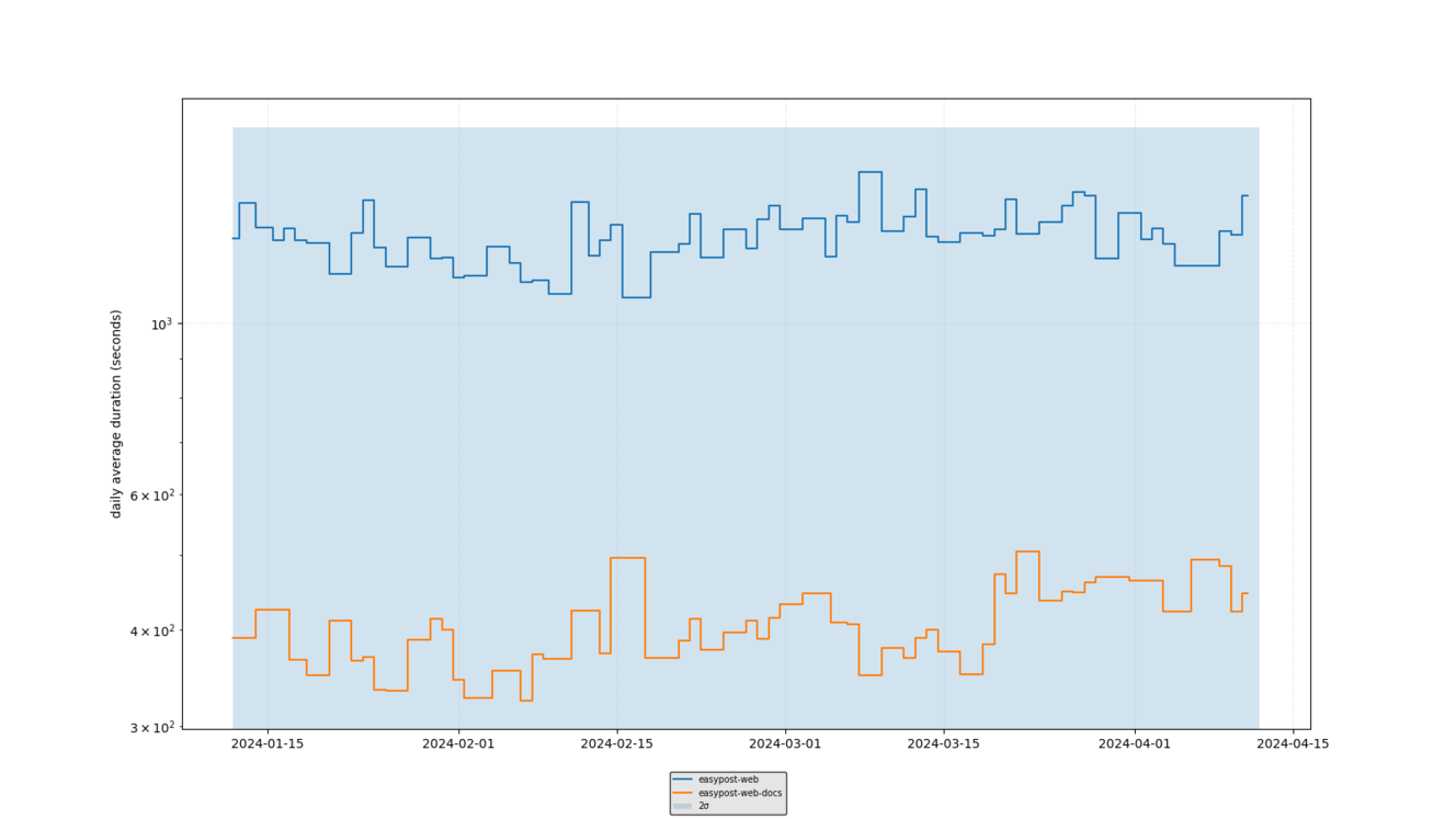
The standalone documentation website builds in a fraction of the time that the regular website does.
The new documentation not only improves performance on our end, but also for our users as well. Notably, our last documentation website was one single webpage, and while that worked in our early days when our API only had a handful of features to document, it didn’t scale well by the time we approached nearly 150 unique endpoints. On top of that, it made it extremely difficult to navigate, with giant walls of text and a subsequently tiny scrollbar. It was also very slow, with some browsers struggling to render hundreds of custom components, different fonts and icons and hyperlinks galore. This was so bad in fact that, as some of you may have discovered, the site often crashed if you tried viewing it on a mobile device.
Good news, our new website doesn’t do that.
Modernized framework
When designing our new site, the most important step was our first one: finding the right framework. We initially evaluated a number of out-of-the-box solutions, such as Docusaurus, that could auto-generate documentation from an OpenAPI spec. At the time, we didn't have a complete OpenAPI spec ready to go for our API, and we decided we still wanted some manual control over the final appearance of our docs. Ultimately, we wanted to strike the right balance of not locking ourselves into a rigid, non-customizable framework, but also not entering “the wild west” where we’d have to implement everything from scratch. Eventually we determined the best framework for our needs was Nextra, a Next.js framework that would allow us to use MDX, a combination of Markdown and JSX React.
Nextra comes with a number of built-in features that we appreciate, including code syntax highlighting, which came in handy for our code snippets, as well as a configurable file routing system, which we reskinned to match our branding. Nextra’s own documentation doesn’t mention much about how to create a custom theme, other than that it is possible. We were, however, able to look through Nextra’s default “blog” and “docs” theme examples and get the inspiration and functionality information we needed to port certain features over to our own theme. Surprisingly, this was less complicated and more lightweight than we had anticipated.
One piece of functionality we ported over, and one we’re really excited about, is the full-text search capabilities baked into Nextra. Powered by FlexSearch, the search bar at the top of our documentation page can scan and index every bit of text content across all pages and present them as the user is typing. This is far better than the previous method of searching through our docs (Ctrl+F), and is especially crucial because now information is split out across multiple pages.
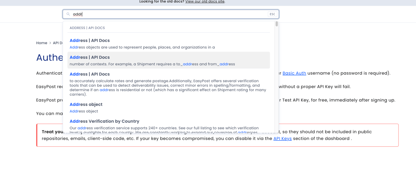
Find everywhere across guides and documentation where “address” is mentioned.
There are a couple limitations to the search, however; the full-text search doesn’t account for text inside React components, only Markdown, and is still keyword-based. For example, searching for the word “apple” will show you all the places in our docs where the word “apple” appears (which is probably nowhere); it won’t, however, also show you results for other fruits like “orange” and “banana” at the same time. Perhaps in the future we’ll add in AI LLM functionality that can accommodate that capability.
Search only working for Markdown text was actually a motivator, however, as we wanted to write as much of our docs in Markdown as possible. One key takeaway we learned from our old documentation website, written in JSX, was our overreliance on raw HTML and React components that, over time, made the website clunky and difficult to puzzle out, especially for non-web-developers. Since we expect other teams at EasyPost, such as our support team, to contribute to our docs, writing content in Markdown would make it far more accessible and maintainable. The majority of the pages in our new docs are written almost entirely in Markdown, with only a handful of basic React components to help with repetitive elements such as tables and dropdown lists, or for more complex elements such as warning banners or code snippets.
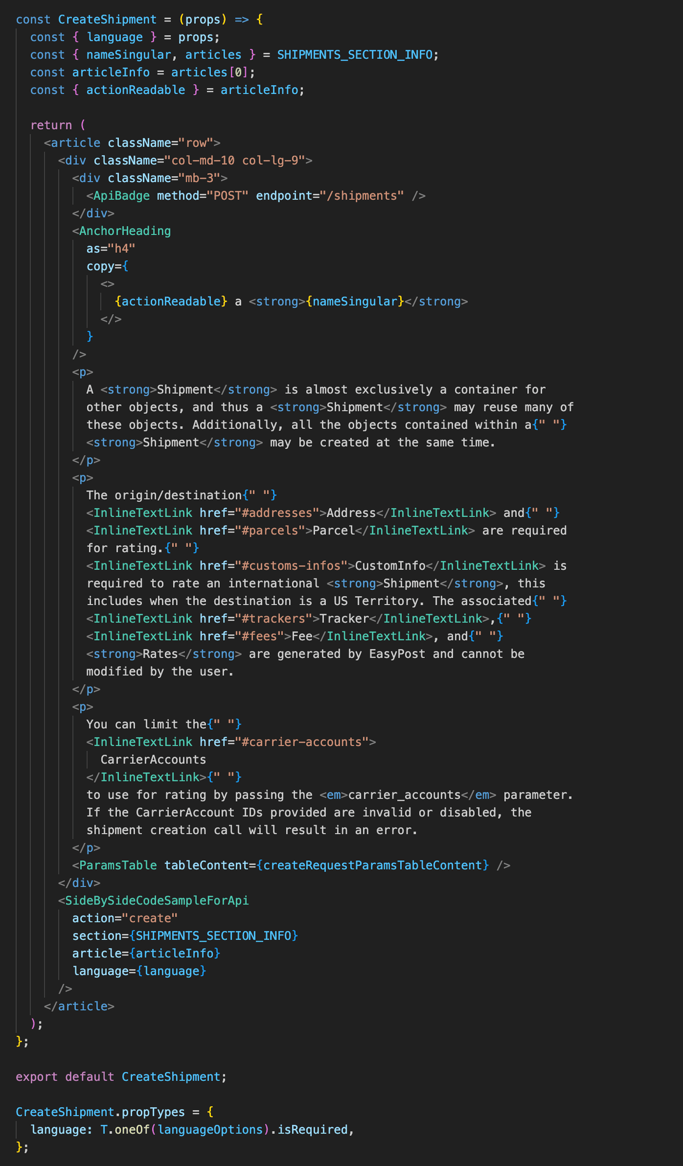
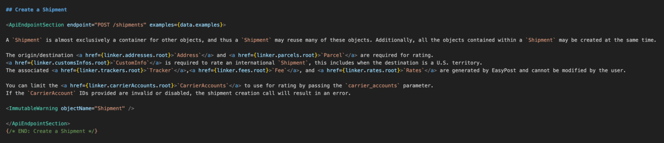
Our old documentation webpages (above) were a mess of HTML tags embedded into derived JSX components. Yes, those are artificial spaces inserted before each InlineTextLink component. With MDX on the same page (below), we were able to strip away most of the HTML clutter and simply write human-readable code.
When it came to designing these React components, we took care to make them as readable and self-documenting as possible. That means self-explanatory component names, a limited number of clearly-defined property names, and docstrings to offer explanations for what a component does. This project is the first to take full advantage of our Easy UI design system, a component library we established last year to help bring a cohesive brand identity to our web properties, which have become somewhat inconsistent through multiple design eras over the years. Our web docs are an example of our vision for the clean, modern, dare we say elegant EasyPost web experience we want to provide for our users.
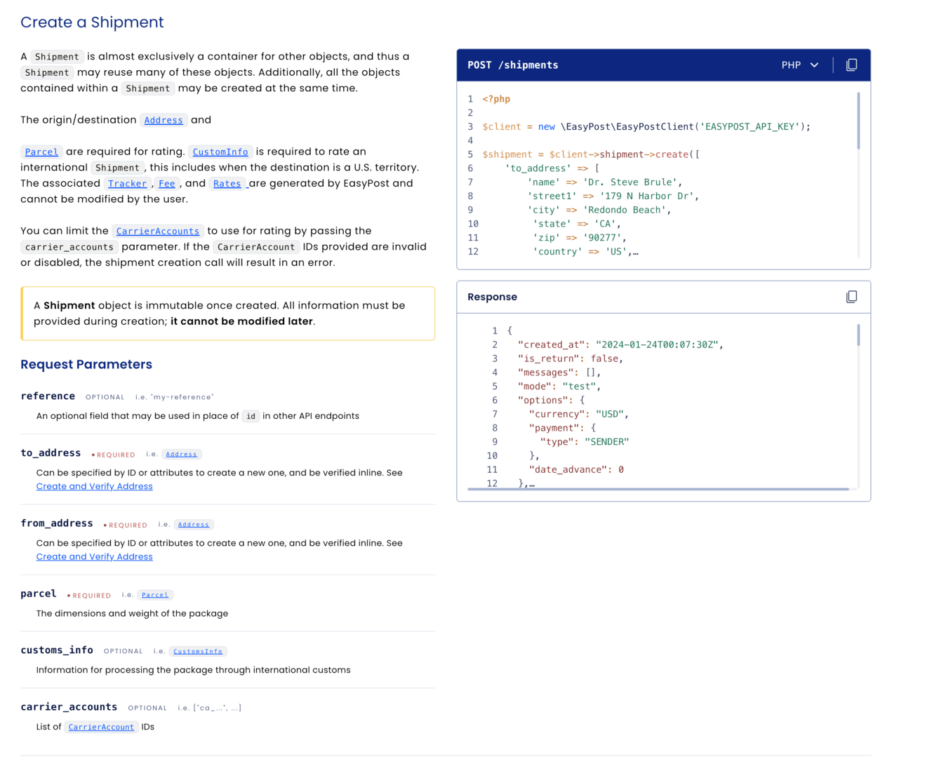
Decluttered layout
In terms of the layout of our docs, we took a lot of inspiration from Stripe and their API documentation, including collapsible parameter lists to cut down on wall-of-text eye fatigue and floating code snippets. In our two-column layout, we’ve added parameter information on the left column, and a set of code snippets and JSON response previews on the right. As users scroll through a section, the code snippets and response previews lock to the top of the viewport. This makes it easy for the reader to refer to them side-by-side with whatever parameter documentation they are currently reading, rather than having to constantly scroll back up to see the corresponding example.
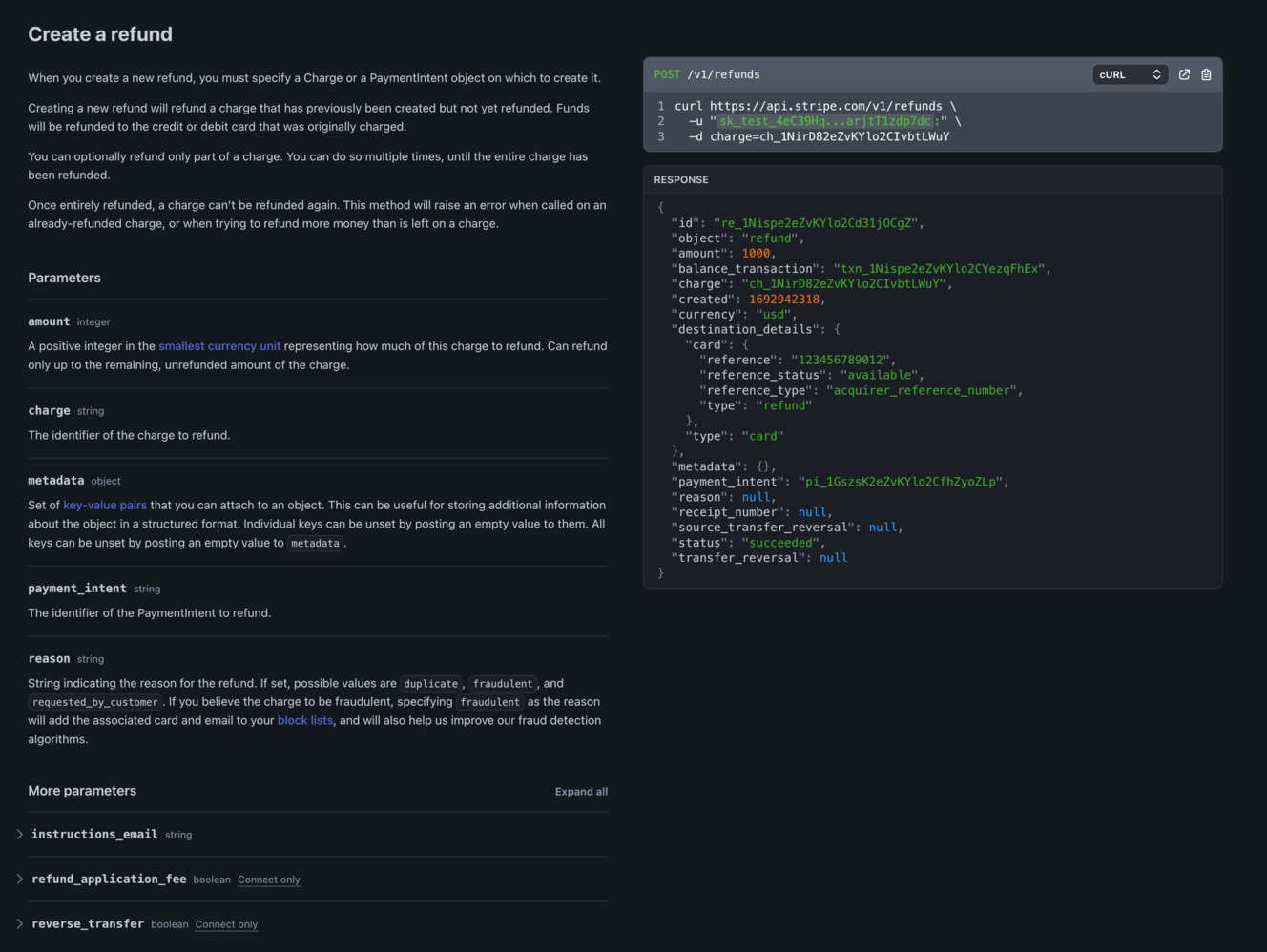
They say imitation is the sincerest form of flattery (EasyPost above, Stripe below).
The snippets also have dropdowns to change the specific programming language, which applies globally and persists through refreshes via local storage. And changing the language can be done on the fly, without needing to reload the entire webpage like on the old documentation website.
Beyond design, we’ve also spent several weeks going through every section of our documentation, cleaning up unclear or inaccurate information. We recently hired a dedicated technical writer who has been revamping every one of our guides, making sure all of our documentation is both comprehensive and easily digestible. And with our decision to go with Markdown for the majority of the content, we’ve opened up maintenance capabilities to members of our support team and others, so any future changes needed can be made much faster and easier than before.
We’ve poured several months of effort into this project, with some members of our team working almost exclusively on the docs since January, and we’re very excited to finally unveil our handiwork. You can check out our new documentation website at docs.easypost.com.