Year after year, shipping becomes more expensive, complex, and burdensome on businesses. In 2024 alone, USPS hiked prices three separate times, with one increase averaging 25%. Other carriers, like UPS, FedEx, DHL, and more have also issued price increases.
On top of fluctuating shipping costs, carrier transit times also waver throughout the year. Inconsistencies in on-time delivery have plagued the shipping industry ever since 2020, and continue to affect shipping times today. Long carrier transit times can negatively impact your customer experience and business operations.
That’s why it’s imperative for businesses to stay agile and adapt to the best carrier and service for them as rates and performance vary throughout the year. The best way to do that with confidence is through data. You can gain insights into your shipping performance, optimize your delivery speed, and uncover cost-saving opportunities with the revamped Analytics dashboard.
What can I see with the analytics dashboard?
Most shipping platforms will only show the average or total cost of your labels, but this isn’t enough to identify areas of improvement and refine your shipping strategy.

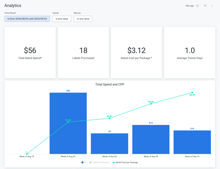
In the EasyPost dashboard, you can filter by time period, carrier, or service to see the following:
- Total rated spend
- Number of labels purchased
- Average rated cost per package
- Average transit days
- And more!
How can I refine my shipping with this data?
A few ways you could use this data to optimize your shipping:
- Review your shipping speed with the average transit days to see if transit times are slower than expected. From there, you can test other services to improve performance and customer experience.
- Use the total rated spend and date filters to compare shipping costs throughout the year. You may find that total spend varies per season, allowing you to more accurately budget and forecast business costs for next year.
- Compare cost per performance with the service split table. This chart shows the total/average cost and number of labels per carrier/service level, so you can easily see which ones are the most cost effective for you.
Interested in more actionable insights?
If you have any questions about the new analytics dashboard or how you can access even greater insights, reach out to your customer success manager today.


